Working is not the same as converting
Your checkout works. Payments clear and pages load quickly. That's the baseline, not the finish line.
Most stores don't lose the holiday season to a broken button. They lose it one visit at a time, when someone lands on the homepage, can't tell where the deals or gift ideas are, and leaves for a store that made it obvious.
Everyone on an ecommerce team knows the vocabulary: empathy, journey maps, pain points. We say those words in kickoffs far more often than we act on them. So this audit starts every check with a shopper rather than a system. The technical checks are still here, at the end.
Keep one question in mind as you go: if someone lands on your store at 9 pm two weeks before Christmas, how many taps until they're looking at something they want to buy or give?
Start with discovery: where are the deals and gifts?
Before you touch filters or checkout, decide how people will find your holiday deals and gift ideas from the homepage. A banner isn't a plan. It's one promise in one place, and shoppers need a path.
Give the season one home: a single holiday page linked from the header and the top of the homepage, not buried three levels down in the menu. On that page and on the homepage, let people browse by size of discount with entry points like "Up to 30% off", "40% and more" or "Under $50". On every product card, show the sale price next to the original price and the percentage, so nobody has to open the product to see the saving. And hold to one promise at the top of the page. When three banners compete, shoppers pick none of them. As the season shifts from Black Friday deals to last-minute gifting, update that one page instead of stacking new banners on top of it.
Discount browsing matters because plenty of shoppers don't arrive with a product in mind. Deal hunters come to fish. They're after the biggest saving rather than a specific item, and if they have to dig through categories to find it, they'll go to the store that already put the deals in front of them. Hand them the fish already cooked. Gift shoppers work the same way, except they're shopping for someone else. Let them browse by recipient and budget, so "something for my dad under $50" is one tap, not ten.
A quick test: open your homepage on your phone and don't scroll. If you can't tell within a few seconds where the deals are and how big they are, that's your first fix.
The 10 checks
Each one takes a couple of minutes to test. Use a real phone if you can, and ideally someone who doesn't work on the site.
Find it
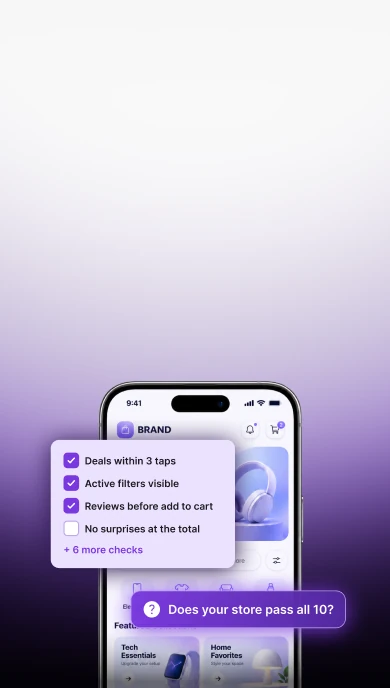
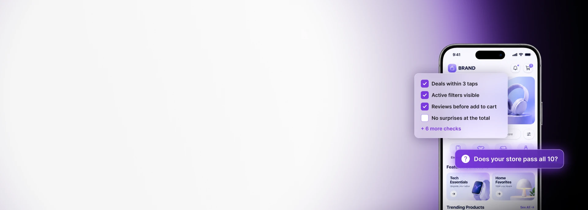
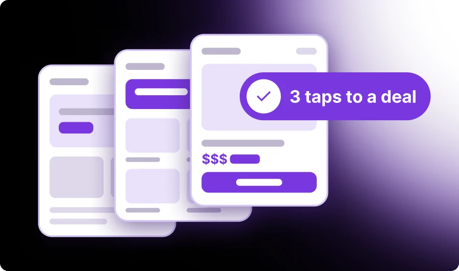
- Deals are no more than three taps from the homepage. Count the taps from a cold landing to a holiday deal or gift. Past three, you're making people work for it.
- Filters show what's applied. Active filters should stay visible, and each one should come off with a single tap. A badge that just says "Filters (3)" tells the shopper nothing. To test it, apply three filters on mobile, then try to remove one without opening the panel.
- Discount is something shoppers can filter by and see. Add percent off and price bands as filters, plus a sort by biggest saving. When a combination returns nothing, the empty state should suggest which filter to drop instead of ending the visit.
Built for the phone
- Thumbs first, on real phones. Mobile brought about 76% of ecommerce visitors over the past year in Dynamic Yield's XP² benchmark, so treat the phone as the main store. Primary buttons belong within thumb reach, add to cart should stay sticky, and tap targets shouldn't punish big fingers. Test on at least two different phones. A resized browser window doesn't count.
Trust
- Reviews show up before add to cart. Put a short rating summary near the price, with the full reviews one tap away. Seeing the rating early settles the trust question before it stalls the purchase, and it's a lot cheaper than a spike in returns later.
- No surprises on price, delivery or returns. Shipping cost, the delivery date and the returns policy should be visible before the cart, including whether the order will arrive before the holiday. Extra costs are consistently the top reason shoppers abandon checkout in Baymard Institute's research, so show the real total early. Once shipping cutoffs pass, say so plainly and point shoppers to faster shipping, store pickup or gift cards.
Checkout
- Paying is the easy part. Guest checkout should be easy to spot. Offer wallets and buy now, pay later (BNPL) options. Then clear out the small frictions: totals shown early, the right keyboard for each field, autofill that works and error messages next to the field they belong to. Forced account creation keeps showing up among Baymard's top reasons for abandonment, so don't make it a condition of paying. If you offer gift messages or gift receipts, put them in checkout where shoppers expect them.
Under the hood
- Core Web Vitals hold up on mobile. Check field data, not just lab scores. Google's "good" thresholds are LCP at or below 2.5 seconds, INP at or below 200 ms and CLS at or below 0.1. At peak traffic, a slow page feels like a broken one.
- Third-party scripts and promo logic are under control. Audit every tag and widget that loads and remove what you don't need. Settle what ships before the busiest days, and pause A/B tests and non-critical releases while they run. Then test every discount rule together: stacking, thresholds, expiry, and whether the cart shows the same amount checkout charges.
- Stock, load and a way back. Test inventory sync and load test for peak traffic. Turn on alerts for errors and slow pages, and have a rollback plan so a bad promo can be reverted in minutes. Then decide who is watching on the peak days, from Black Friday and Cyber Monday through the last shipping days before Christmas, and how they reach the people who can fix things.
How to use this list this season
Black Friday on November 27 opens the season and the last shipping days before Christmas close it. Start by walking the journey yourself on your phone, from homepage to paid order, as if you'd never seen the site.
Then fix what blocks the shopper earliest. Discovery comes first (checks 1 to 3), because if people can't find the deals, nothing after that matters. Purchase blockers come next (checks 4 to 7), and the technical side gets locked down last (checks 8 to 10).
Lock in your changes early so the busiest days stay quiet. Prepare content swaps in advance, like moving the homepage from deals to last-minute gifts, so you can spend the peak days watching rather than tweaking.
The technical work is what makes the sale possible. The experience is what makes people buy, and it's the part the shopper actually feels.
None of these fixes expire on January 1. Clear navigation, honest totals and an easy checkout convert a shopper in March just as well as one in December, so the work you do now keeps paying off long after the holidays.
Get a second set of eyes before the rush
It's hard to see your own store the way a first-time shopper does. Our CRO team can walk your site through these 10 checks on real phones and hand back a list of fixes ranked by what costs you the most sales. Book a holiday UX review with Mira.