.webp?compression=lossy)
When a new project starts and we begin working with a new brand, our first instinct at Mira is always to understand the reality of what is already there.
As a design team, we are very data-driven. We audit the current site, the experience, the content hierarchy, the performance, the design decisions, and how everything aligns (or doesn't) with modern standards. From that point on, the question becomes: How can we make this better?
How do we innovate? How do we build something that sells, feels alive, and visually represents the brand in the best possible way?
That part changes from project to project. The creativity, the personality, and the visual language all evolve. But there are things that don’t change.
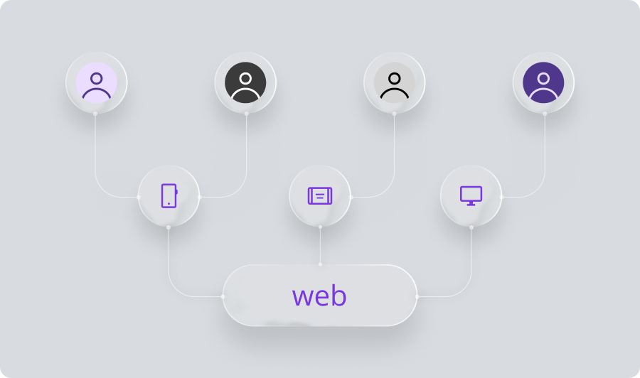
One of the biggest constants is this: we design for everyone.
"Everyone" means the broadest range of users including people with different abilities, different devices, different contexts, and different needs. That is why ADA compliance and WCAG guidelines are not optional. They aren't something to "add later" or push to a "second phase." They are part of designing well, designing ethically, and designing with intention.
So when we talk about Designing for Compliance, these are the core principles we keep in mind on every project.
1. Color Flexibility Over Brand Dominance
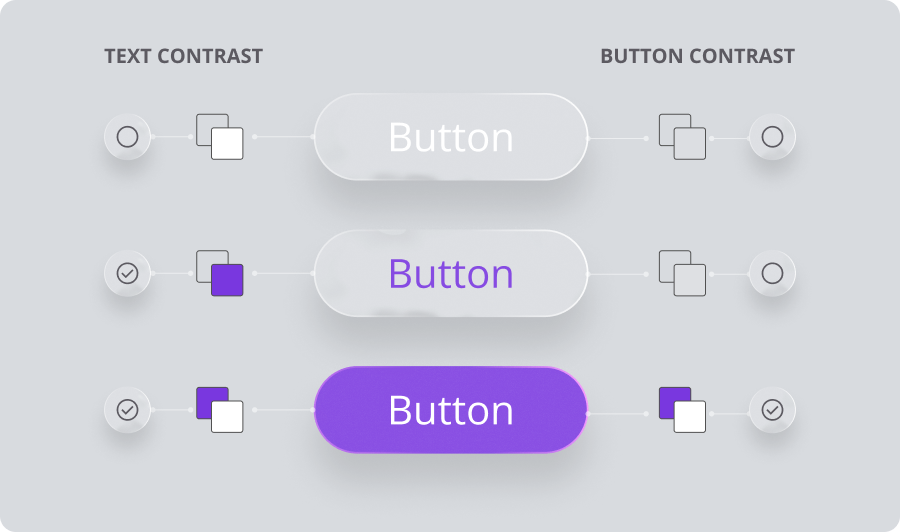
Many brands think their primary color must dominate the whole interface. But to design for compliance, we need a flexible and high-contrast palette.
My personal rule: Don’t marry your brand color.
We know how important your brand is. Use it as your signature, but allow other colors to support accessibility, clarity, and conversion. If users can’t read or distinguish what is on the screen, nothing else matters. Strong color contrast lays the foundation for accessible and inclusive visuals.
2. Typography Carries Responsibility
Fonts are not just aesthetic choices. They impact readability, legibility, tone, and information hierarchy. We need to be conscious and intentional about selecting type that supports both usability and brand personality.
3. Logical Information Hierarchy
At Mira, we work from general to specific. We think about how users scan, read, and move through content. A clear and predictable hierarchy is not just great UX. It is essential for accessibility.
4. Size and Spacing Matter (A Lot)
Interactive elements need to be substantial. Spacing helps people (and machines) understand what belongs together. Good spacing gives users breathing room and reduces cognitive load.
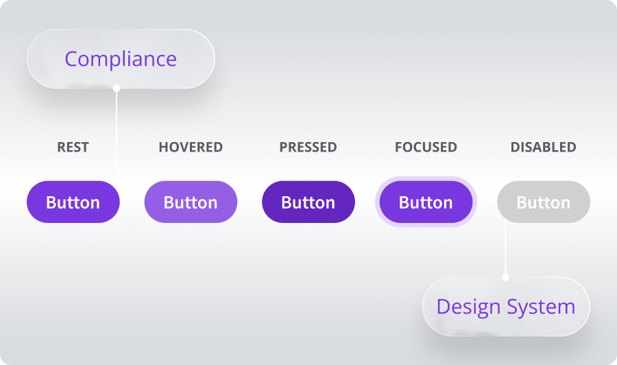
5. Strong UI Kits Create Consistency
Components must include all states: default, hover, focus, active, disabled, and error. This consistency translates directly into accessible code and proper behaviors like clear focus states and accurate alternative text.
6. Compliance is a Team Effort
Accessibility is not just "a design thing." It is a collaboration between designers, developers, QAs, content creators, and clients. When everyone is involved, accessibility becomes part of the product culture rather than a checkbox.
Why This Matters
At the end of the day, designing for compliance isn’t about avoiding fines or meeting a requirement. It is about creating digital products that more people can use and enjoy. It is about making the experience stronger, not heavier. And honestly, it is about doing better work.
When we design for accessibility and compliance, we are also designing for clarity, conversion, and trust. We are building products that look great, perform well, and welcome all users. That is ultimately what great design is supposed to do.
Putting It Into Practice: A Quick Guide
As I mentioned, compliance is a team effort. Here are some simple best practices to help every project move in the right direction.
For Content Teams
Write meaningful headings. Clear hierarchy helps users and screen readers navigate effortlessly.
Keep it concise. Short paragraphs improve comprehension. Remember the designer's mantra: “Users don't read, they scan.”
No text inside images. If it is important, it needs to be real text, not a graphic.
Accurate Alt Text. Describe the purpose of the image, not just what is visually present.
Links with intent. Avoid "click here." Instead, describe the action (e.g., "View our case studies").
Mindful emphasis. Don’t rely only on color or ALL CAPS to communicate meaning. Combine styles responsibly.
For Designers
Contrast is King. Build your palette around WCAG contrast ratios (4.5:1) rather than just brand restrictions.
Consistent shapes. Define consistent border-radius values so users recognize interactive elements instantly.
Readable sizes. Avoid extremely thin weights or fonts smaller than 14px (16px is our recommendation).
Touch Targets. Treat 44px as your absolute minimum. We recommend 48px for desktop and 52px height for mobile.
Generous Spacing. Spacing increases focus and groups info correctly. I know balancing this is a challenge, but analyzing the top players in the industry helps!
Document Every State. Don't work alone. Talk with developers and QA to ensure you are addressing Focus, Hover, Active, Error, and Disabled states.
Ultimately, designing for compliance is about shifting our mindset from "constraint" to "opportunity." It challenges us to be more disciplined, more empathetic, and more innovative in how we solve problems.
At Mira, we don't see accessibility as a separate lane. It is the only road worth taking. By baking these standards into our process from day one, we ensure that the digital experiences we build aren't just beautiful for some, but functional, welcoming, and exceptional for everyone.
Related Posts

.webp&w=3840&q=75)
.webp&w=3840&q=75)